Blue-Yellow-Black Visual Management
Hello and welcome to Small Batches with me Adam Hawkins. I’m your guide to software delivery excellence. In each episode, I share a small batch of the theory and practices along the path. Topics include DevOps, lean, continuous delivery, and conversations with industry leaders. Now, let’s begin today’s episode.
This episode is a tribute episode to my colleague Alex Karpinski. Alex reported to me for about two years.
I don’t remember when it happened, but Alex had a simple request somewhere early on. Alex had a hard time differentiating between the red, yellow, green colors the team used in Miro. Alex requested we create a more accessible color scheme with higher contrast.
We selected three colors: blue, yellow, black. Adopting these colors created a “Cambrian explosion” of visual management techniques in the team.
Now, Alex is seeking employment elsewhere. However, using these three colors is now a deeply ingrained habit that I, and I hope Alex, will carry forward.
So, in this episode will cover how I use these three colors in the visual management of the daily work.
First, it’s March so that means there’s a new giveway!
This month I am giving away a free signed copy of Katie Anderson’s book Learning to Lead, Leading to Learn. I had Katie on the podcast last month. Checkout that episode to learn more about her and the book. The giveaway runs through March 2024. Entries are limited to the United States. Listen through to the end for entry details.
Now, let’s talk about visual management. Hang with me. This one will be longer than normal.
The best description of visual management comes from _The Toyota Way_ by Jeffery Liker. He describes it as “Use visual control to support people in decision-making and problem-solving”.
I’ll use visual management and visual controls interchangeably in this episode. Toyota leans into visual control because humans are visual creatures. Vision trumps all other senses.
Hear something and three days later you’ll remember 10% of it. Add a picture and you’ll remember 65%.
The point is, humans need to _see_ something to truly understand it. Hearing about it or reading about it is not the same.
A picture is worth a thousand words for a reason.
I doubled down on visual management when I became an engineering manager. My aim was simple: convey the status of everything the team was doing in a single visual.
There were a few core areas: high-level deliverables, the kanban board, and our system health indicators. Early on we used red, yellow green. That is until Alex requested a more accessible color system. This truly changed everyone’s daily work.
People implicitly understand the Red, Yellow, Green from traffic lights. Generally, Red is stop or “bad”. Yellow is similar to “warning”. Green is good or just “go”. These are not really sufficient for encouraging problem-solving or decision-making.
Alex’s request for an accessible color scheme forced us to break out of this mental model and create our own.
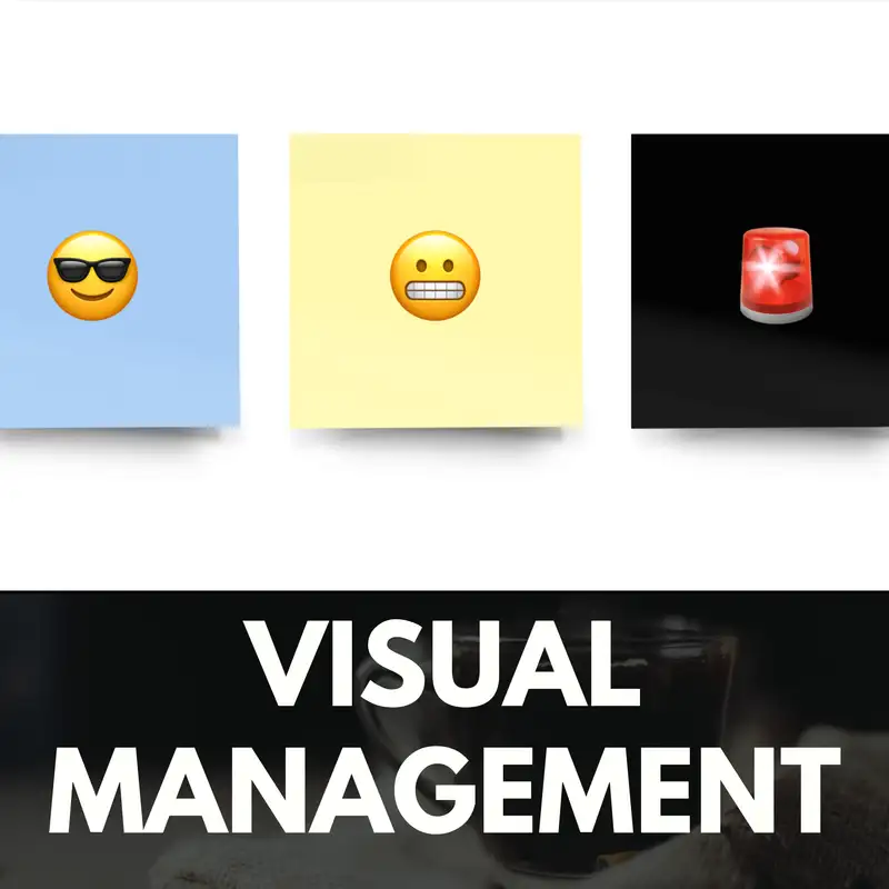
Here’s ours. Blue is “system normal”. Yellow is “manageable challenges”. Black is “problem! Stop for swarming.”
The crucial change in this blue, yellow, black model is the black color. Grading anything as black is the signal for the team to stop and engage in problem-solving. Then the aim, becomes turning that sticky yellow or blue. Simple, but not always easy.
We lean into these colors by adding emojis. Blue may be a thumbs up, happy smiling face, or person with sunglasses depending on context. Yellow is typically a neutral or grimacing face. Black is the rotating light siren.
Using emojis enhances the visual management by giving the viewer another picture to relate to. It also allows us to adapt the three color to different contexts. These three colors are flexible enough for two core uses.
The first use case is a health indicator. This is a point in time assessment about anything. It could be an SLO, a deliverable, or the running cost of a given system. Blue is a thumbs up or “all good”. Yellow is a grimacing face but OK. Black is the siren, “Stop, swarm this problem!”.
Designing our visual management like this embodies the first capability from _The High-Velocity Edge_. The first capability is designing systems to quickly surface problems. This is coloring anything black. Then the second capability kicks in: stop and swarm on problems.
The second use case is a viability asssessment, typically used in A3s, or other forms of problem-solving. Blue is like two thumbs up or “this is great”. Yellow is like the neutral face, workable but not excited about this. Black is thumbs down, the red x, certainly not viable or acceptable by any means.
Here’s how we use these color in the daily work.
Daily and weekly ops reviews are centered around groupings of health indicators on a Miro board. Select all the stickies, then set the color to gray. This simple act does two important things.
First, it resets any previous grades. Second, it makes the remaining work visible. This is another aspect of visual management. Many types of work can be made visible, not just cards on a kanban board. Now, any team member identify the next step by looking at the board: go grade the stickies.
Each person grades the relevant stickies. There’s beauty in this step too. Using a simple blue, yellow, black systems enables the grader to mix subjective and empirical information. Sometimes, assessments are based on empirical numbers like SLIs or dollars spent. That’s not always possible for whatever reasons. Sometimes empirical information is not available and that’s OK. Sometimes it’s just a person-to-person call. All that’s OK because the outcome is the same: a blue, yellow, or black.
Grading only takes a few minutes depending on how many there are.
Then the next benefit kicks in. Zoom out of the miro board. Zoom out even more to where the text is not visible. You only see color. That’s everything you need as a decision-maker. Aggregating based on color compresses complex information so it’s accessible extremely fast. That’s what your brain is best at. 10, or 100, or 1000 stickies. Your brain will see colors and patterns.
This is where the next aspect of visual management kicks in. The blue, yellow, black grades fits 5S thinking naturally. The colors naturally sort the information. Start from black, then yellow, and finally blue.
Next, walk the black stickies that indicate a need for problem-solving. In ops review this typically means a brief discussion of the current condition, then outlining goalie-duty work for the on-call engineer.
If there are no black stickies, then maybe yellows are discussed without committing to follow up work.
Given blue means systems normal, it may not even be worth attention.
I’ve grown to appreciate how scalable the blue, yellow, black grading system is. It can be used as coarse or as granular as needed. I leverage this in my 1:1s.
The first example is with grading high-level deliverables. Deliverables are typically at a project or OKRs level. These are one-level above the kanban board. Each team member is typically working on their own and shared deliverables through pairing.
I lay out those deliverables as stickies in the 1:1 board. They’re reset to gray prior each meeting, then the other person grades them. The aim, as always, is identifying the black items.
Grading a sticky black signals management problem solving. If something is graded black, then that opens the conversation. Is this a technical problem? Is it a WIP problem? What could it be? Let’s discuss that together, then identify countermeasures. It may also be that something is just going to be stuck like that because of external dependency.
If there are no black items, then maybe we briefly discuss yellows, but always pass on the blues. Time is better spent elsewhere, such as celebrating the success in the current condition.
The point is grading these deliverables builds a shared understanding between myself and the other person. Now, I as the engineer manager, have what I need as the decision maker.
Deliverable stickies can be coarse or granular. If a deliverable has been graded yellow or black too many times in a row, then perhaps it’s time to reduce the batch size by splitting out multiple stickies. When that happens perhaps something is actually _done_ where another part is black. Compressing and expanding the stickies enables me to find the goldilocks zone for information transmission.
Then we move over to the “health indicators” portion of the 1:1. There is a single sticky for “Systems”. This is purposely coarse because it aggregates so much information. It’s a way to quickly communicate the health of complex systems. It’s squishy and that’s intended.
Another example is the “catch-all break-glass indicator”. This is for _whatever_. The point is a way to pull my andon cord for anything. I’ve had people grade that one black for HR problems, leave challenges, or inter-personal issues.
This system works because the blue, yellow, black grading. Black implies a call-to-action: problem-solving with me. Yellow indicates places for possible assistance. Blue means everything is OK, move on.
I create a new board for each 1:1, so I can zoom out over weeks, months, and even years in some cases to see trends. My favorite is watching deliverables go from black, to yellow, then blue, and ultimately green for done.
Now, I’ve taken this concept into my skip-level meetings. I begin each meeting by asking the person to report blue, yellow, or black for themselves. They know reporting black is the signal to engage in problem-solving.
Reporting black has been used to team changes, reworking deliverables, and to coach up their team engineering manager. Plus, I can zoom out on this information and quickly see the general sentiment amongst all my skip-levels.
This episode would not be complete without covering the A3. An A3 is a visual problem-solving and
decision-making tool. Color is a key facet in all parts of the A3.
The blue, yellow, and black grades convey health indicators in the background, current condition, and analysis sections. They convey viability assessments in the recommendation section.
This is where the three color scale gains two additional colors: purple and pink. These are especially useful as table headers. Think rows and columns. I cannot you tell how many sticky note tables I’ve created in the past two years. Individual cells or whole groups can be graded blue, yellow, or black.
The point is not grade, but the thinking behind the grading. Consider a problem. There are multiple proposed countermeasures. What actually makes a countermeasure viable? You must answer that question _before_ grading something. This mental shift forces you to think more upfront before jumping to a conclusion.
Assessing viability of related countermeasures or proposals also creates a happy side effect. Zoom out a bit from the table to see the colors. Most of the time a black grade in one place can change by remixing it with aspects of another. This encourages the deep-problem necessary to create a menu of viable alternatives.
One last example on the flexibility of this blue, yellow, black scale. Last year I used an A3 to approach restructuring our Datadog contract. This was a challenging problem. I leveraged these colors to help me partition the problem space by cost.
My aim was to create a PFEP, where each part was an individual line item in the contract. The outcome from the plan was a management system to deliver on-budget for the year. That requires assessing risk of overruns and costs of each.
Time to pull out the handy sticky note table. Purple for headers, then rows for cost, risk and a few others.
A black for cost was simply three dollar signs, aka the most money. Yellow for costs was two dollars signs. Blue was a single dollar sign.
A black for risk was the screaming emjoi. Yellow risk was the grimace emoji. Blue for risk was the person with sunglasses emoji for I’m cool.
Set the colors for the table to gray, then blue-yellow-black ‘em. Results from all the various criteria were aggregated into a final blue-yellow-black grade. The black items went into the “now” work bucket, yellow into “next”, and blue into “later” to await pull.
I covered a ton of ground in this episode. This is because the approach to visual management built around the blue-yellow-black grading scale has been ingrained into my daily work.
Most of 1:1s can be done async by grading the sticky notes prior to the meeting. Then focus on any items graded black. This is a massive time saver.
I convey the health of team deliverables, my teams, and whatever other items to my manager using blue-yellow-black. The callout right at the top of the repeating agenda is that items graded black warrant discussion. If there is nothing graded black, then we cruise right on through to discussion. No need to waste time talking when writing and grading conveys the same information.
This blue-yellow-black grading has become a ubiquitous language. We have blue, yellow, and black square emojis aliased to the simple blue, yellow, and black shorthand. Team members send each other the blue, yellow, and black in a variety of contexts.
All of this is thanks to a simple request from a colleague for an accessible color grading systems.
So, thank you so much to Alex for creating this seismic shift in visual management. More over, for challenging me as a manager and leader. You made me better at everything I did. I will keep these lessons with me.
I hope you bring these lessons forward with you. Best of luck in your future endeavors.
Alright, that’s all for this batch.
I need your support to keep this podcast viable. I’ve setup a patreon to support this podcast and its cousin, the Software Kaizen substack. Your support ensures I can continue producing Small Batches episodes like this one and long-form written content on Software Kaizen.
Go to SmallBatches.fm/104 to a link to my patreon, the free march giveaway, and more on visual management.
I hope to have you back again for the next episode. Until then, happy shipping.
Creators and Guests